Flight Booking Experience
End-to-End UX Flow Design
Designed to simplify a complex multi-step booking process and reduce user friction across critical decision points.
UX & Product Design
Fligh Booking Design
Mobile
Usability, Accessibility, Interaction
Overview
Context
Designed a complete mobile flight booking experience from search results to payment, focusing on reducing friction, simplifying decision-making, and improving conversion across the booking funnel.
Goal
Create a seamless and intuitive booking experience that guides users from flight selection to payment, while minimizing complexity and cognitive load across multiple decision points.
User research
To understand user expectations and common patterns in flight booking, I analyzed several existing platforms including Wizz Air, Ryanair, Vola, Momondo, Kiwi, and Aegean. The goal was to identify recurring interaction patterns, usability issues, and opportunities for improvement, especially on mobile devices.
Key Observations
Most platforms rely on multi-step flows, but often combine too much information in a single screen
Search forms are frequently dense and overwhelming, especially on mobile
Editing search criteria is often disruptive, requiring users to restart or navigate back
Calendar interactions vary, but many are not optimized for quick selection
Pricing visibility is inconsistent, making comparison harder
Opportunities
Simplify the search flow into clear, focused steps
Reduce visual complexity and cognitive load
Allow quick, in-context editing of search criteria
Improve clarity in date and price selection
Design specifically for mobile-first interactions
Problem statement
Booking a flight involves multiple steps and decisions, including selecting flights, entering passenger details, choosing baggage options, selecting seats, and completing payment.
Without a well-structured flow, this process can quickly become overwhelming, leading to drop-offs and incomplete bookings. The challenge was to design a flow that balances necessary complexity with clarity and ease of use.
Hypothesis & Solutions
Instead of treating each step as a separate screen, I approached the experience as a continuous decision-making flow, where each step builds on the previous one.
• Reduce cognitive load by breaking complex tasks into smaller steps
• Maintain context throughout the flow
• Use smart defaults to minimize repetitive actions
• Prioritize clarity over density
User Flow
The booking flow was structured as a linear, step-based experience.
It was designed to progressively guide users through decisions, reducing the need to process multiple variables at once.
Search flight
Flight selection
Passenger selection
Baggage customization
Seat selection
Payment
High fidelity wireframes
The design focused on reducing cognitive load, minimize repetitive actions and priorotize clarity over density.
Flight Selection
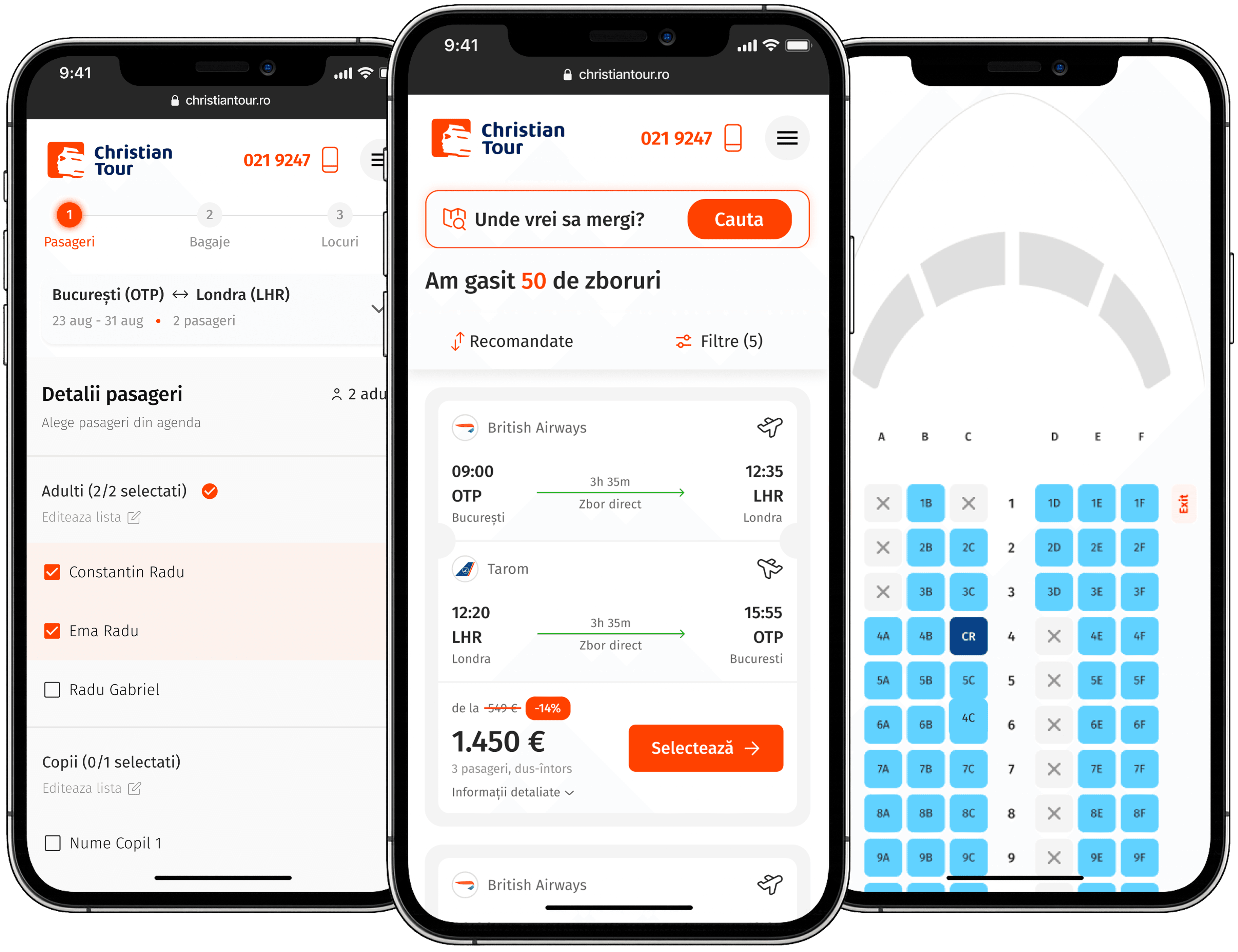
Users start by selecting a flight from a list of available options, where key details such as departure time, duration, and price are clearly presented for easy comparison.
Additional flight information is integrated directly within each flight card, allowing users to explore details without leaving the listing.
This grouping of information helps maintain context and reduces cognitive switching, creating a smoother and more efficient browsing experience.


Passenger Selection
Passengers can be selected directly from previously saved profiles, eliminating the need for manual input. This approach significantly reduces input time and minimizes errors, especially for returning users.
By replacing manual entry with quick selection, the booking process becomes faster, smoother, and less prone to friction.
Baggage Customization
Baggage selection is designed to balance flexibility with simplicity, allowing users to customize choices individually or apply them across all passengers and flights.
Smart defaults help reduce repetitive actions and streamline decision-making, making the process faster and more intuitive.


Seat Selection
Seat selection is presented through a visual seat map, enabling users to quickly identify available and occupied seats at a glance. Color coding highlights different seat types, including business and higher-priced options, making it easier to compare and choose the best fit.
A dedicated modal interaction was introduced to isolate seat selection, reducing interaction conflicts and keeping the task focused. It also provides a quick, consolidated overview of seat choices across all passengers, making the process clearer and easier to manage.
Payment
The payment step was simplified to a single interaction per method, allowing users to quickly proceed with their preferred option.
Primary payment methods are visually prioritized to support faster decision-making.

Results & Conclusions
Results
The design targets key friction points that directly impact conversion - reducing manual input, simplifying decision-making, and maintaining context throughout the flow. With a baseline conversion rate of 1.51%, the goal was to streamline the booking experience and improve completion rates within a complex journey.
Input effort is minimized by shifting from manual entry to selection-based interactions. The flow remains consistent and uninterrupted across steps, helping users stay oriented and engaged. Complex decisions are broken down through progressive disclosure, making them easier to navigate. Overall, friction is reduced at critical conversion points, supporting a smoother and more efficient path to completion.
2.23 % conversion rate
(1-3% industry standard)
Key learnings
Designing a complete booking flow reinforced that the goal isn’t to eliminate complexity but to structure it in a way that feels manageable and intuitive. Breaking down complex processes into smaller steps significantly improves usability and reduces cognitive load.
Smart defaults help minimize user effort, allowing people to move faster with less friction. Maintaining context throughout multi-step flows is essential to keep users oriented and confident in their progress.
Finally, reducing friction in the later stages of the journey can have a disproportionate impact on conversion, where small improvements often lead to meaningful gains.
Future improvements
Introducing personalization based on previous bookings can make the experience feel more relevant and reduce repetitive input. Adding contextual recommendations—such as seats or baggage - can guide users toward better decisions while increasing overall value.
Seat selection can be further optimized through a clearer visual hierarchy, helping users quickly understand options and availability.
Tracking drop-off points across the flow would also provide valuable insight into where users disengage, enabling more targeted improvements over time.